MitraSETI Explained Simply
Every major concept explained using everyday analogies — no prior knowledge required
This page is a plain-language companion to the full MitraSETI tutorial. Read it first if you want the story before the math and code.
1. The Big Picture
One whisper in a stadium
Imagine standing in a stadium of 100,000 people all talking. One person is whispering a message meant for you. MitraSETI is the system that tries to find that whisper.
- Stadium = the universe (and everything the telescope hears)
- 100,000 people talking = RFI and noise — overwhelming local interference
- One whisper = a potential extraterrestrial or other faint cosmic signal we care about
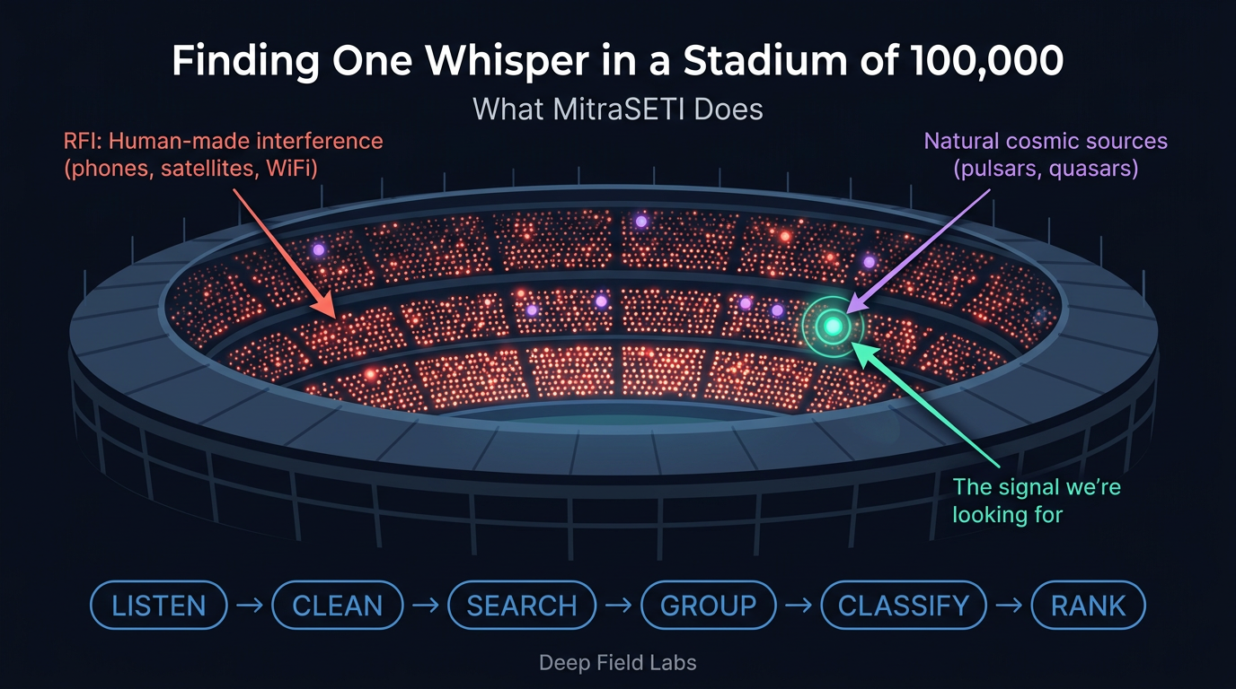 MitraSETI's job: finding one whisper among 100,000 voices
The pipeline in six words
End-to-end, the story is:
LISTEN → CLEAN → SEARCH → GROUP → CLASSIFY → RANK
Each step has a technical name in the long-form chapters; here we only need the intuition.
2. What is a Spectrogram?
A spectrogram is a picture of power across frequency and time. Think of a piano combined with sheet music:
- Which key you press = frequency (how high or low the tone)
- When it is played = time (left-to-right or top-to-bottom on the plot)
- How hard you press = brightness / power (how strong that tone looks in the image)
Why astronomers love them
A narrow carrier from space often shows up as a thin bright track — like one note held for a few seconds on the score, if the Earth and source are not moving too wildly.
The grid (frequency × time)
Below, frequency increases to the right; time runs downward. Letters stand in for brightness (stronger = brighter characters).
  freq →   low ──────────────────────────────── high
         ┌────────────────────────────────────────┐
  time   │  .   .   ·   ·   ·   ·   ·   ·   ·   │
   ↓     │  .   .   ·   █   ·   ·   ·   ·   ·   │  ← one strong channel at one time
         │  .   .   ·   █   ·   ·   ·   ·   ·   │
         │  .   .   ·   ·   ·   ▓   ·   ·   ·   │  ← weaker patch elsewhere
         │  .   .   ·   ·   ·   ·   ·   ·   ·   │
         └────────────────────────────────────────┘
3. What is RFI?
RFI stands for Radio-Frequency Interference — human-made (or sometimes natural) signals that leak into the telescope data. It is like noisy neighbors in an apartment building while you are trying to record a bird outside the window.
Neighbors in the building
- GPS = neighbor blasting the same song 24/7 on repeat
- WiFi = someone slamming doors — short, sharp bursts
- Power lines = the elevator motor hum that never quite goes away
- Satellites = a helicopter overhead — periodic flyovers, very strong when overhead
| Source | What it does in the data | Typical strength |
|---|---|---|
| GPS / GNSS | Narrow, stable lines at known frequencies; often everywhere | Very strong |
| WiFi / Bluetooth | Bursty broadband hash or hopping patterns | Strong near sites |
| Power / electronics | Harmonics at multiples of 50/60 Hz and switching noise | Moderate to strong |
| Satellites | Drifting or periodic bright tracks as they move | Extremely strong when in beam |
Scale
RFI can be a million times stronger than the signal we hope to find from space. It is like trying to hear a whisper standing next to a jet engine.
4. Spectral Kurtosis: Removing RFI
Spectral Kurtosis (SK) is a statistical test that asks: “Is this frequency channel behaving like quiet thermal noise, or like something artificial?”
The coin-flip test
Imagine 100 fair coins. Each is flipped 20 times. If one coin comes up 20 heads, you do not shrug — you conclude that coin is rigged. SK does the analogous thing for channels: over many samples, some channels are “too lucky” to be innocent noise.
Bouncer at a club
SK is like a bouncer. It checks each channel: “Are you behaving normally?” If not, it kicks that channel out (masks it) so it cannot ruin the rest of the search.
 Before and after: Spectral Kurtosis removes interference, revealing the hidden signal
Why thresholds must adapt
Fixed thresholds fail because different observations have different noise levels, weather, and setups. MitraSETI calculates thresholds automatically for each observation so the bouncer is not using yesterday’s rules for tonight’s crowd.
5. The Doppler Effect
When an ambulance speeds toward you, the siren sounds higher; when it passes and moves away, it sounds lower. The siren did not change — your line-of-sight motion changed how the waves arrive.
On a spectrogram, a narrow signal whose frequency drifts steadily often appears as a slanted line (diagonal track), not a vertical stripe.
Diagonal = drifting frequency
Time runs downward; frequency runs to the right. A source whose observed frequency increases over time draws a line that slopes down-right to up-right depending on axis convention — the key idea is: drift ⟷ diagonal.
  frequency →
         ┌──────────────────────────────────┐
         │  ·   ·   ·   ·   ·   ·   ·   ·   │
    time │  ·   ·   ·   █   ·   ·   ·   ·   │
      ↓  │  ·   ·   ·   · █ ·   ·   ·   ·   │   ← drifting narrowband signal
         │  ·   ·   ·   ·   █   ·   ·   ·   │      (Doppler / acceleration)
         │  ·   ·   ·   ·   · █ ·   ·   ·   │
         │  ·   ·   ·   ·   ·   █   ·   ·   │
         └──────────────────────────────────┘
6. Brute Force De-Doppler
De-Doppler means: try to straighten the diagonal so all the energy from one source piles up in one place — like tilting your head until a tilted picture frame looks level.
Foggy window and a ruler
Picture a smeared line on a foggy window. You do not know the angle. Brute force means: try every ruler angle until the smear collapses to a dot. It works — you just try a lot of angles.
For rough scale, think: 1,000,000 channels × 16 time steps × 300 drift rates ≈ 4.8 billion basic operations to explore that grid naïvely. Real pipelines add clever indexing, but the intuition is “enormous brute-force search.”
Cost
This works, but it is SLOW at full survey scale. That is why the next section exists.
Brute-force-style cost: number of drift trials × time steps × frequency channels (conceptual).
7. Taylor Tree: The Fast Way
The Taylor tree avoids redoing the same work for every drift hypothesis. Instead of measuring every angle from scratch, it combines partial answers the way a tournament bracket combines winners.
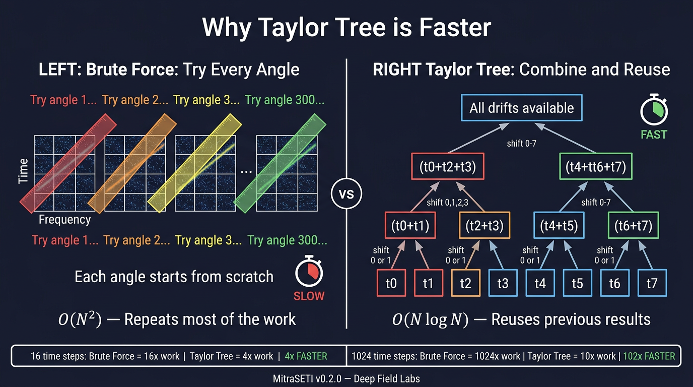 Brute force tries every angle from scratch. Taylor tree combines pairs and reuses results.
Tournament bracket intuition
Imagine pairing players in rounds: each match produces a small set of winners. The next round only combines those winners — you do not replay the entire season for every possible final matchup. The Taylor tree does the same with time chunks and drift hypotheses.
How the tree is built (simplified)
- Layer 0 → 1: Pair adjacent time steps; compute results for shift = 0 and shift = 1 (coarse drift resolution).
- Layer 1 → 2: Combine pairs of those blocks; the effective shift set doubles — 0, 1, 2, 3.
- Final layer: After enough levels, you have covered a wide range of drift rates with far fewer redundant passes than brute force.
Speedup at a glance
Relative work grows much more gently with the number of time steps when you reuse structure:
| Time steps | Brute force | Taylor tree | Speedup |
|---|---|---|---|
| 16 | 16× | 4× | 4× faster |
| 64 | 64× | 6× | ~10.7× faster |
| 256 | 256× | 8× | 32× faster |
| 1024 | 1024× | 10× | ~102× faster |
8. HDBSCAN Clustering
After de-Doppler search you may have hundreds of thousands of raw detections. Most are noise or RFI fragments. HDBSCAN groups nearby hits in frequency–drift space so we can treat each tight clump as one candidate event.
500 pins on a map
Scatter 500 pins on a map of a country. Many pins sit on top of each other in a few metro areas. HDBSCAN finds those 5 cities automatically: dense regions become clusters; isolated pins in the desert are noise.
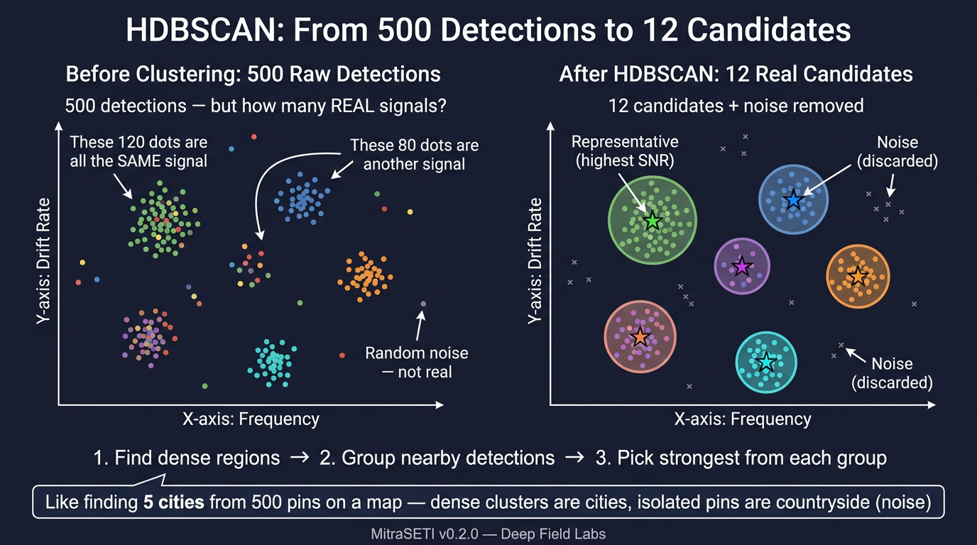 HDBSCAN groups 500 raw detections into 12 real candidates, discarding noise
Representing a cluster
Dense regions = real clusters worth a second look. Isolated points = usually noise. For each cluster, MitraSETI typically keeps the strongest detection (or a robust summary) to send downstream.
9. ML Classification
Machine learning does not replace physics — it prioritizes. After clustering, each candidate still needs a score for “how interesting is this?”
Two lenses, one decision
The CNN answers “what does the texture look like locally?” The Transformer answers “how does this whole patch hang together?” The scorecard then ranks survivors so humans review the best few percent first.
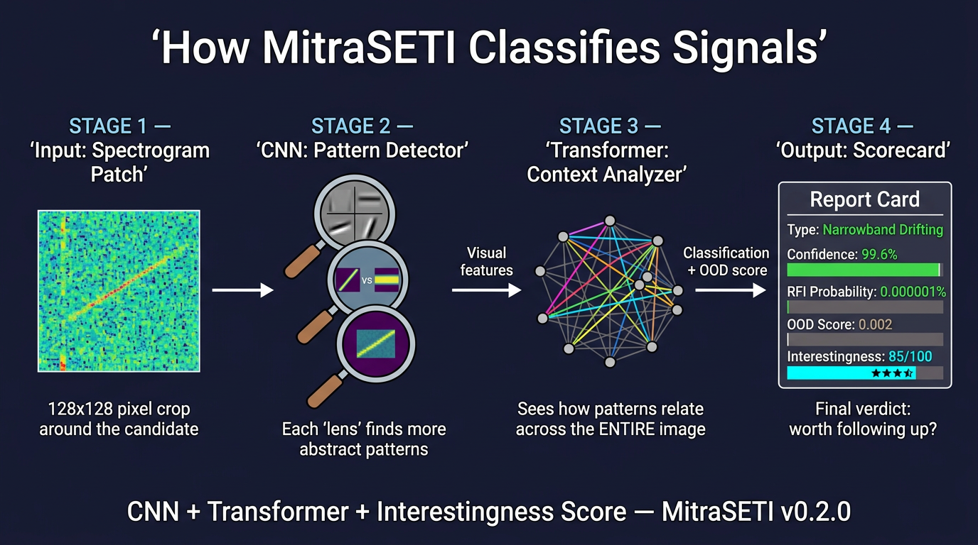 CNN finds patterns, Transformer sees context, Scorecard ranks the candidate
CNN — many magnifying glasses
A CNN slides small filters over the spectrogram patch like a stack of magnifying glasses of different sizes, picking up edges, blobs, and textures that humans learn to spot by eye.
Transformer — forest vs trees
A Transformer relates every part of the patch to every other part. Instead of only local texture, it can capture global context — the difference between seeing a single tree and noticing the whole forest is on fire.
OOD and interestingness
An out-of-distribution (OOD) score asks whether the example looks like the training distribution or like something weird (which might be garbage — or genuinely novel). The interestingness scorecard combines several hand-crafted or learned cues into one rankable number.
| Factor | Plain-language meaning |
|---|---|
| SNR peak | How bright the candidate is compared to local noise |
| Spectral width | Is it needle-thin (good for narrowband SETI) or smeared? |
| Drift coherence | Does power follow a single straight drift track? |
| RFI proximity | Is it hugging a known bad frequency or satellite band? |
| Morphology | Does the 2D shape look like a line, arc, or blob? |
| Temporal stability | Does it persist sensibly across time steps? |
10. How It All Fits Together
Here is the full story as a single flow — from photons hitting the dish to a short list on your screen.
    ┌──────────┐    ┌─────────────┐    ┌──────────────────┐    ┌────────────┐
    │  LISTEN  │───▶│    CLEAN    │───▶│     SEARCH       │───▶│   GROUP    │
    │ telescope│    │ SK + masks  │    │ De-Doppler       │    │  HDBSCAN   │
    │ + ADC    │    │ (kick RFI)  │    │ Taylor tree      │    │ clusters   │
    └──────────┘    └─────────────┘    └──────────────────┘    └─────┬──────┘
                                                                      │
                    ┌─────────────┐    ┌──────────────────┐           │
                    │    RANK     │◀───│    CLASSIFY      │◀──────────┘
                    │ scorecard   │    │ CNN + Transformer│
                    │ + human QA  │    │ + OOD / interest │
                    └─────────────┘    └──────────────────┘
| Metric | Value |
|---|---|
| Input files processed | 100 |
| Raw detections | 288,952 |
| High-priority survivors after filtering & ML | 11 |
| Approximate rejection rate | 99.996% |
Sanity check from the real sky
The top detection in one validation run: Voyager 1's carrier at 8.4 GHz, drift 0.287 Hz/s, SNR 47.18 — a near-perfect test case because we already know the spacecraft is there.
Algorithm Summary
| Algorithm | What it does | Analogy | Speed |
|---|---|---|---|
| Spectral Kurtosis | Flags / masks non-Gaussian channels | Club bouncer tossing troublemakers | Fast per channel |
| Brute de-Doppler | Integrates along every trial drift | Every ruler angle on a foggy window | Slow (huge Nd × Nt × Nf) |
| Taylor tree | Multi-resolution combination of time blocks | Tournament bracket reuse | Much faster at long integrations |
| HDBSCAN | Density-based clustering in feature space | 500 pins → 5 cities | Fast for ~10⁵–10⁶ points |
| CNN + Transformer | Local patterns + global context | Magnifying glasses + forest view | GPU-bound; amortized per candidate |
Glossary
| Term | Simple definition |
|---|---|
| RFI | Human-made radio noise that drowns out the sky — neighbors, satellites, power lines. |
| Spectrogram | Image of signal power vs frequency and time — like piano keys × sheet music × loudness. |
| SNR | Signal-to-noise ratio: how much taller the whisper stands above the background hiss. |
| Drift rate | How fast the observed frequency changes over time (Hz per second) — Doppler + acceleration. |
| De-Doppler | Mathematically “un-slanting” a diagonal track so energy stacks in one bin. |
| Spectral Kurtosis | Statistical test for “too spiky” or “too calm” channels compared to Gaussian noise. |
| Taylor tree | Divide-and-conquer structure for fast coherent drift search without full brute force. |
| HDBSCAN | Clustering that finds dense blobs of arbitrary shape and labels sparse points as noise. |
| OOD score | How “weird” vs training data an example looks — catch novel artifacts or rare signals. |
| Technosignature | Any observable sign of technology (here: narrow radio carriers and similar patterns). |